Pages

Friday, June 29, 2012

Another Look at our July Kit!

"My Knight" by Leslie Kammerdiener

This is my little Kevin way back when he was just a youngster! I have no idea how old he is in this photo, but I am guessing maybe 5 ish? He and the neighbor kids always played sword fights with full regalia on and Kevin actually keeps a photo of the 4 of them on his nightstand.


From the Flower Add-On
Prima: Millicent Vine: Doodle Deux
Prima: Lady Godiva: Strawberry Ice

From the Embellishment Add-On
My Mind's Eye: Be Happy Chipboard Elements
Prima: En Francais Alphabet Stickers
Pink Paislee: London Market: Collage Sheets

Wednesday, June 27, 2012

Sneak Peek #5

 Today we give you another sneak peek at our July kit featuring paper from Inkido.  The paper and add-ons are available now in the store.  Any kits we have left over after sending them to members, will be available in store on July 1st.


"Goaste FarFar" by Camilla Ekman

My kids adore their grandfather and I managed to capture them on a few photos a while back. I love the blue and white flowers that comes with the kit and the add-on kit.
 Here I have used them to create a cluster. 


border punch, doily, leaves die, swirl die

Monday, June 25, 2012

There's Still Time....

Hi everyone.  You've still got time to enter this month's sketch challenge which ends June 30th.  Here's another look at the sketch.


Photobucket

Our prizes this month are a gift certificate to the C'est Magnifique Store and a beautiful chipboard album.  So get busy creating, and head to THIS blog post to upload your layout!

**************************

New in the Store - Maja Design

We have 22 sheets of patterned paper from the beautiful Maja Design's Vintage Summer Basics available in the store.  There are 8 more designs available in this collection that are not in the store (hint, hint).  Here's a look at a few sheets of this line:


Friday, June 22, 2012

Sneak Peek #4

We have an amazing layout to share with you today, created by Erin Blegen.  
This layout gives you a great look at the wonderful paper by Inkido.

"Lovely Eyes"

Okay, so what prettier kit to use with photos of my beautiful baby girl? She is such a charmer!!  I just can't get over all the pretty pinks and reds- and so I went for a super girly page with this one!  I created some layers with a couple different sheets of paper, and then did some fussy cutting (lots of opportunity with this paper!!), which enabled me to keep down on the number of flowers used on my layout.  The bits of border punching and paper layers add just enough texture and femininity to my page, topped off with some pretty pearls.


If you are interested in purchasing the paper from the July kit, it is available here.

Wednesday, June 20, 2012

Sneak Peek #3

Design team member, Valerie Serfozo, used the July kit in a totally different way, 
by using a kraft colored background.

"Love You Mer"


************************

Check back Friday for more inspiration!

Monday, June 18, 2012

July Kit Sneak Peek #2

Today we're giving you a chance to see how Fi Kenward used the July kit:

"Sisters Always"

 These papers were perfect for this vintage photo of my Mum
 and her sister when they were younger. - Fi


Thursday, June 14, 2012

Three Ways to Use Earth Tones

Today is the last day for a look at some of the design team's layouts using the June Kit.  I thought we would take a look at a few different ways members of the design team took advantage of the browns and earth tones in this kit.

Grand Canyon by Leslie Kammerdiener

This is a photo of the stunning Grand Canyon 
just as the sun was starting to set. Such beautiful colors!!


~~~~~~~~~~~~~~~~~~~~~~~~~


Since the photo I chose is primarily neutral colors, I decided to stick to those colors 
for the layout. This is my niece with such a sweet smile for her baby brother. 
She really loves to mother him.


 From the Flower add-on:
Petaloo Forget Me Nots
Manor House Sugar & Spice
Prima Buckskin Laredo flowers

From the Embellishment add-on:
American Crafts Chestnut Thickers
Bo Bunny Country Garden Noteworthy Die Cut
Meg's Garden Lace Doily
FabScraps Picket Fence

I wanted the chipboard picket fence (in the embellishment add-on) to have a distressed look. To achieve this, I painted it with gesso and while the gesso was still wet, I added some embossing powder. Then I heat set it. The gesso doesn't provide clear coverage like an embossing ink would, and gives it a mottled look. 


~~~~~~~~~~~~~~~~~~~~~~~~~

Keeper Of by Fi Kenward

This is a picture of my Dad when he was a kid with his dog.  I don't have many of my dad when he was this age. Since the paper had some quotes in reference to little secrets I thought this photo worked in perfectly.  I know when I was a kid my dog knew all my secrets and I bet I was half as mischievous as my dad.


From the Embellishment Add On:
Prima: Wood Tickets: Sun Kiss
Maya Road: Canvas Buttons
Dusty Attic: Grass Cluster
Prima: Blossom Bud Ink Edger
Maya Road: Skinny Mini Spools

We hope you enjoyed taking a look at three very different ways of using earth tones and brown for your layouts.  Tomorrow I'll be back with the first look at our July kit and the add-ons.  If you subscribe to our newsletter, you have already seen the preview, so I'll be sure to add something new for you to see.  

If you want to be the first to see our kit each month, subscribe to our monthly newsletter by entering your e-mail in the gold box on the left sidebar (join out mailing list).  We only send 2 newsletters each month, so we won't bombard your in-box!

Wednesday, June 13, 2012

Bits & Pieces Winner!

It's the 13th of the month, and time to announce the winner of our June Kit Bits and Pieces give-away!  I think we had a record number of entries this month, which makes us very happy.  We wish we could share a little bit of our June kit with all of you, but there can be only one winner.

 The lucky number this month is #36.  Congratulations to Melenia from Greece!  Leslie will be contacting you for your mailing address, and sending you a box of scrapping goodies - her leftovers from the June kit.  Have fun creating with this amazing kit and the paper from Les Papiers de Pandore and Meg's Garden.

Monday, June 11, 2012

Erin, Beverly, Camilla, & Nadia Share their Designs

Hi there.  We are back today to share more layouts with you created by our design team using the June kit, which we have available in our store.  These four layouts show off the beautiful blues and greens in the kit.

Boys from the Woods by Erin Blegen


I love that my two boys get to grow up in the woods like I did. There's so much to learn and see- it's a harder life by some standards, but I think it really is a good one. I love the idea of my boys growing into "manly men", lol!! Boys who can hunt and fish and show you the best places to do so :)- boys who can drive a truck, a 4-wheeler, split firewood, and aren't afraid to get their hands dirty...
I really really love that this kit gives such a great opportunity to scrap both masculine and feminine layouts. I definitely took the "naturistic" route with this one, perfect for my photos and for scrapping about my boys- and the usual outdoor pictures I tend to take since we spend a lot of our time outside. And the green/blue shades I've used here are perfect for keeping my photos in color, rather than having to revert to black and white.

From the Flower Add-On:
Petaloo: Forget Me Nots

From the Embellishment Add-On:
Pink Paislee: Spring Jubilee Tags
American Crafts: Chestnut Thickers
Bo Bunny: Country Garden Noteworthy Die Cuts
Meg's Garden: Lace Doilies

From My Stash:
Tim Holtz "Frayed Burlap" Distress Ink
jute cord
gray ink

~~~~~~~~~~~~~~~~~


A fantastic photo of my niece, Maja. I framed the photo with different flowers from the flower add-ons. To match the red berries in the corner I added a red border underneath the photo. 

From the Flower Add-On:
Petaloo: Forget Me Nots
Manor House Creations: Marguerite/Sugar & Spice Combo
Prima: Sun Kiss Vinetta Flowers

From the Embellishment Add-On:
Meg's Garden: Lace Doilies

From my own stash:
leaves, border punches

~~~~~~~~~~~~~~

Better With Love by Beverly Sams


My nieces continue to amaze me with how beautiful and smart and kind they are~ I like to think this one takes after me....she's an artist, too, and a very talented one at that! For this page, I used one of my favorite Martha Stewart punch-around-the-page punches and distressed it slightly.

In addition to the main kit:

From the Flower add-on:
Petaloo: Forget-me-nots

From the Embellishment add-on:
Bo Bunny: Country Garden Noteworthy die-cuts
Jesse James: Button Flowers
Meg's Garden: Lace Doilies

From my stash:
Martha Stewart: border punch
Sizzix: embossing folder
Tim Holtz: distress ink: vintage photo
Tim Holtz: distress ink: faded jeans
Tim Holtz: Alterations dies: Tattered Pinecone
Flocking
white chalk ink
Scribbles: 3D paint: white

~~~~~~~~~~~~~~~~~

Beauty Blooms from Within by Nadia Cannizzo 


For this layout I went down another direction in regards to colour.  I decided to use the neutral colours of the papers together with the greens to add some colour.  I used many of the die cuts here to create a layered look at the back of the photo.


From the Flower Add On
* Petaloo Forget me Nots
* Manor House Creations - Marguerite /sugar and spice combo
* Prima Sunkissed Vinetta Flowers

From The Embellishment Add on
* Bo Bunny Country Garden Noteworthy Die Cuts
* Prima large window closers
* Megs garden - Lace doilies

Thursday, June 7, 2012

June Kit Layouts

Here's some inspiration from our Design Team who have been using our June Kit:

"Love" by Leslie Kammerdiener (owner)

This is my friend Opal and her husband, Glenn. We met Opal last year when we were living in The Family House in Pittsburgh while Kevin was having surgery there. Her husband was in Stage 4 cancer and was sent home on Hospice at that time, but Glenn passed away this past Thursday morning - a full year after they expected him to! I created this layout to send to Opal so she has something pretty to remember him by; just something to hang in the house.


 *******************************************

"Heart Breaker" by Valerie Serfozo

When I want to add color to a layout, I like do it by adhering the background paper to a piece of cardstock. Just this thin border of blue helps bring out the color of her hair bows. I used distress ink to color the doilies, to further bring in the shades of blue.  


*****************************************

"Nature" by Fi Kenward

 I had so much fun working with these papers.  This is just another snap captured on the Day.  I just love how tame the birds are once they get over their frenzy of feeding...lol.


Tuesday, June 5, 2012

June Bits & Pieces Give Away

It's that time of the month again when we give our readers a chance to win the Bits & Pieces from Leslie's kit.  Our June kit, "My Cottage Garden", features paper from Les Papiers de Pandore (a French company) and Meg's Garden (Australia).  Here is a photo of what Leslie had left-over from her kit:


We are giving all of you a chance to win everything in the photo, and we will ship it anywhere in the world, free of charge.  Please note that you will receive partial packages of embellishments, and some of the paper may be less than full size.

All you need to do is enter your full name using the Inlinkz button below.  You have until midnight June 12th to add your link.  Good luck!  We will announce the winner, by a random draw, on June 13th.

Monday, June 4, 2012

A Tutorial by Beverly Sams

Did you see the gate on Beverly's layout in the sketch challenge post?  She created a very distressed look and a tutorial so you can see how she achieved this look:


Crackled Paint Tutorial

The look of crackled paint on wood is very simple to achieve with this technique and customizable with any color you desire! In just a few quick and easy steps, you'll have an effect that looks much more difficult than it really is. 
For this project, I used a dark brown paint for the base and a creamy white for the top layer. 
You might want to practice first on a small piece of scrap chipboard or paper.

Materials needed:

Chipboard piece
two colors of craft paint, one light and one dark
plain Elmer's glue
a soft paint brush


 Start by brushing on a medium coat of the darker paint onto the chipboard
 and let dry completely. Usually one coat is sufficient.


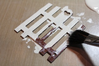
 You can use a brush for the next step, but I simply 
smeared on a thick coat of the glue with my finger.

 
 Let the glue dry slightly, but not completely. Some areas will start to dry and look clear. 
This is when I begin to apply the next paint layer.


Using a soft brush, load a somewhat heavy amount of paint onto the brush and apply gently over the glue, not pressing hard, but sort of skimming the top and floating it on. 
Paint in the direction you would like the cracks to appear, such as length wise for vertical pieces. If you want thinner, finer cracks, use less paint.


You will start to see cracks appear almost immediately.


Let dry completely. I like to use ink on the edges just to give it a bit more of an aged look. Experiment with different amounts of glue and paint. 
A thinner layer of the top coat of paint will produce smaller cracks closer together. 
Use different colors to customize to your project. Have fun with it!


Thank you Beverly for this tutorial.  If you use this technique, we hope you will show us your finished product.  You can post it in our Gallery or post in the 
comment section of this blog post and provide a link to your blog. 

Saturday, June 2, 2012

Winner of our May Sketch Challenge

It's time to announce the winner of our May Sketch Challenge.  
Thanks to all of you who participated.  


The winning layout is #17 and it belongs so Asa Svedberg.  Congratulations, Asa!  Since you used our May kit to create your layout, you have won a $20 gift certificate to the C'est Magnifique Store.  Leslie will contact you with all the information.  
Here is the winning layout:


***********************************

We have also selected five layouts to feature this month.  It's never an easy thing to do.  The following layouts have been selected this month (in no particular order):


"Sweetheart"by Dana Tatar


"Imagine" by Lindy G


"You Colour My World" by Leanne Nankervis


"Just Darling" by Chantelle


"Honey" by Maria Tsimirlka

One of these five featured layouts has won a beautiful stamp from La Blanche.  
The winner of this prize is:

Chantelle, that's you!  Your layout is the fourth one listed.  Congratulations!
Leslie will be contacting you for your shipping address.

Once again, thanks to all of you who participated in this challenge.  
Check back tomorrow for all the details on our June sketch.