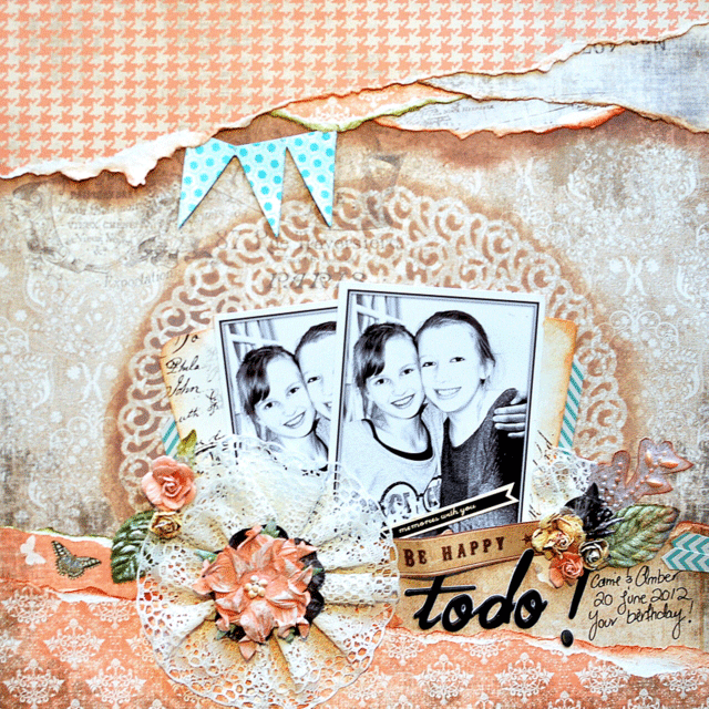
Our September Guest Designer, Helen Tilbury, has put together a tutorial showing you how she created this layout using our September Kit, Fly Away.
I have a little 'step-by-step'
here for you to replicate my page or do something similar
if you feel like it :)
1. Choose your base paper and the printed papers you want
to use for your torn pieces - tear the pieces, ink the edges
then layer the pieces up together as shown below.
2. Lay your newly created torn top section over the
top of your base paper (without adhering) then lightly
mark around the edge with a pencil - remove torn piece
then ink with walnut ink (or similar) along your pencil
outline, about half an inch inside and half an inch outside
your line (so one inch in total) using a sponge or applicator
so that you make a nice smudgy line. Wait at least 10 minutes
for the ink to dry before gently erasing your pencil markings.
3. Now adhere your torn strip piece to your layout and
admire the lovely depth you have just created :)
4. Use a stencil/mask (here I used a Vintage plastic
doily) together with the same ink pad you used to
create your depth up top to create your detail in the
centre of your layout (where your photos will go).
5. Don't worry about inking up the bottom section as
this will be covered up ultimately by another 'torn strip'
section just like what you made for the top of your layout
so make another one and adhere it to the base of your layout.
NOTE - Do not place your adhesive right at the edge of
the strip but rather half an inch in so that you can push
your photos in and down behind it.
6. Now adhere your next torn layer to the base of your
layout. Make a fan with your photographs and some printed
papers (or packaging like I have used here). Ink the edges
then tuck them in just behind/beneath your torn strips.
7. Now have fun embellishing away! I tucked in some
bunting at the top, added some flowers and lace (I used a
gluber {giant glue-dot} and folded the lace around it into
a circle shape) then layered a couple of flowers on top of it.
8. Add in some hand journaling, a title and some sentiments
(which I took from the paper and the Prima packaging) a bit
of bling and of course some gesso dry brushed over the top!
Voila! Your layout is complete!


Hi Helen, really love those torn edges, and how you incorporated a vintage doily to complete the background... amazing layout and thanks so much for sharing the instructions....
ReplyDeleteThank you for the tutorial Helen...and now I want to get my hands on that vintage plastic doily.
ReplyDeleteThis is gorgeous Helen! Thank you for the technique tips!
ReplyDeleteGreat tutorial!!! Thanks Helen so much!
ReplyDeleteLove Helen's amazing work and thanks for this great tutorial!! ~ Blessings, Tracey
ReplyDeletehttp://gracescraps.blogspot.com/
This is so pretty Helen - what a fantastic page and tutorial. Great work!!
ReplyDeleteSo appreciative of the directions on how to create this great layout! You are the best girlie!!!!
ReplyDelete